Higher Standards Academy
(in association with Major League Baseball)
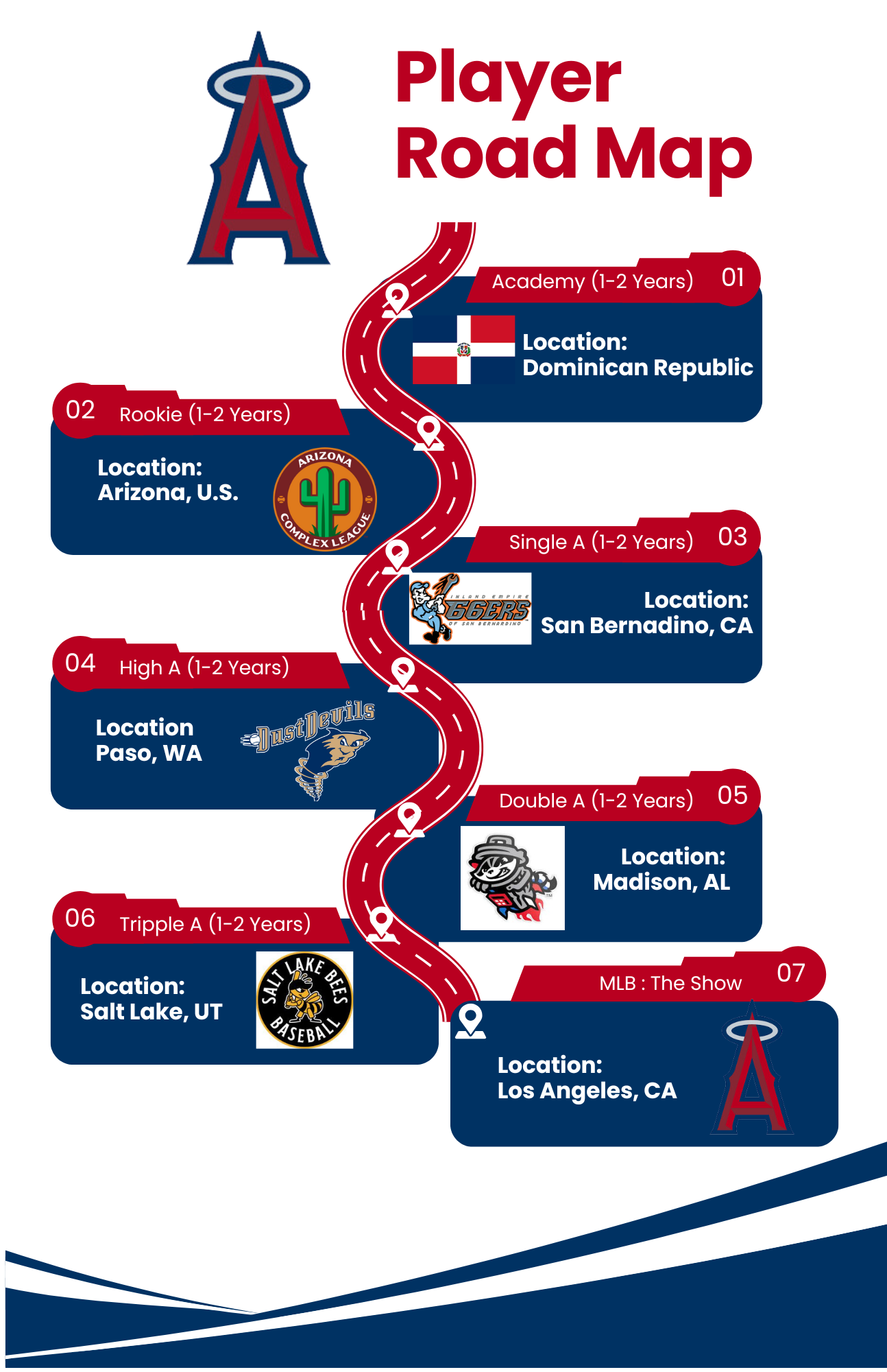
I was tasked with creating a digital graphic that visually represents the journey from the minor leagues to Major League Baseball (MLB) for the teams we work with, Los Angeles Angels, Atlanta Braves, Texas Rangers, Oakland A’s, and Detroit Lions. Designed for international up-and-coming baseball players, this graphic serves as an informative roadmap, illustrating the progression toward their MLB team. I developed a clean and engaging design that effectively conveys the step-by-step path through the minor league system. I was instructed to use Canva to make these designs. The project required collaboration and refinement over a two-week timeline before final approval, ensuring clarity and accuracy in depicting the professional baseball trajectory. The following is an example of the two formats requested for each team.
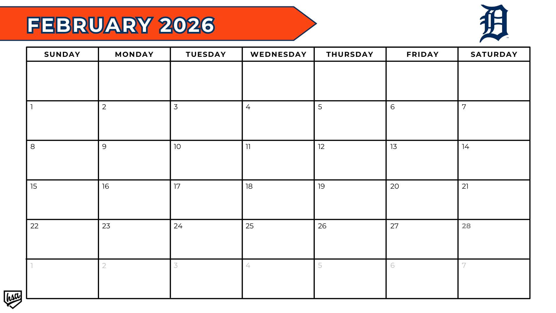
I was tasked with designing a fully branded 2026 season calendar, customized for each of the academy's partnered teams. The objective was to create a visually cohesive and functional tool to organize both corporate and athletic events throughout the year. I focused on incorporating each team's unique identity while maintaining consistency across the entire calendar system. Careful attention was given to typography, color palettes, and layout structure to ensure clarity and usability. Despite a tight two-day turnaround, the project was completed ahead of schedule and approved without any revisions, highlighting both the effectiveness of the design and my ability to deliver under pressure.
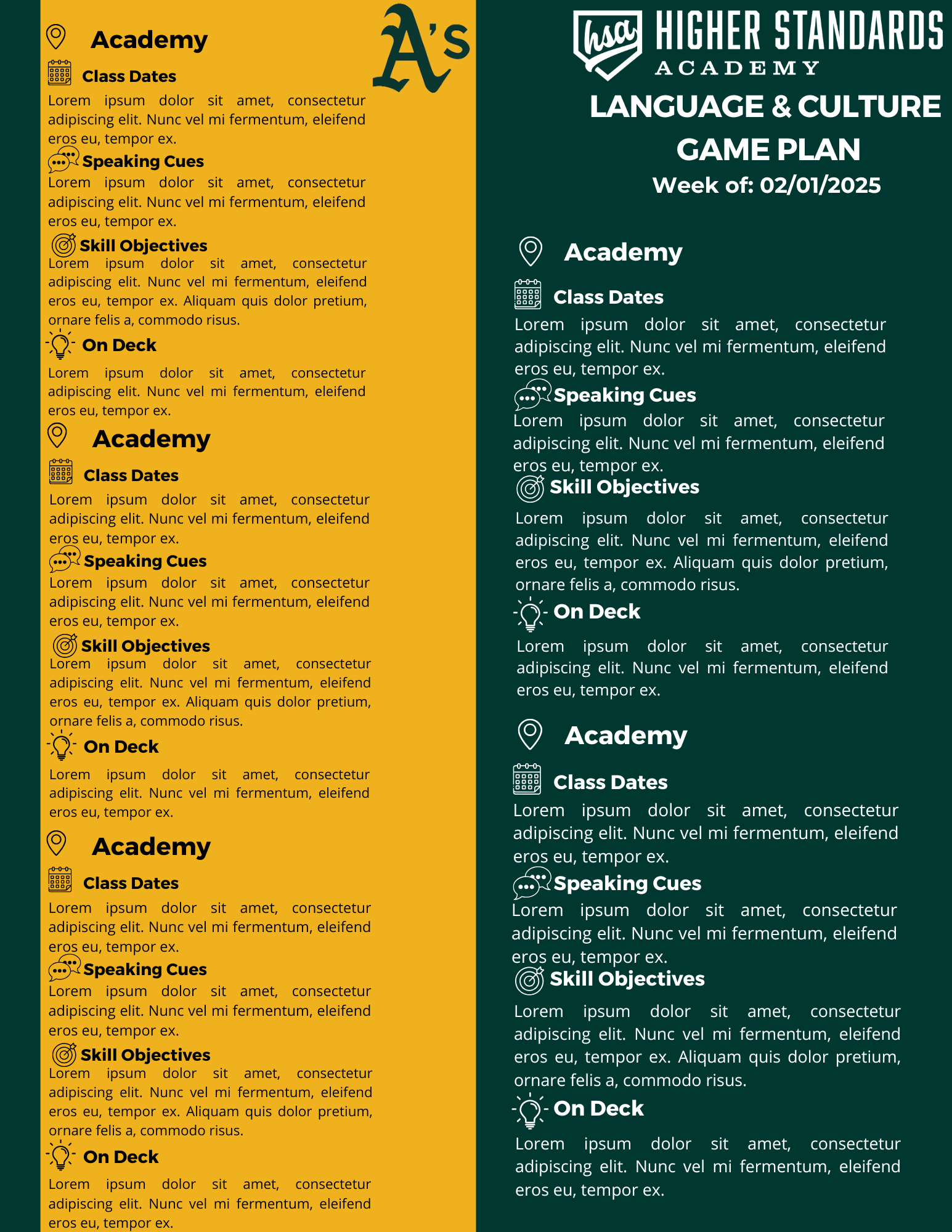
I was commissioned to design a branded email marketing template that could be adapted for each of the teams they partner with. The template was intended to serve as a key component of their ongoing email marketing efforts. The project spanned approximately three weeks and presented some early challenges due to limited initial direction from the client. I began by designing a template focused on a single location within the Detroit Lions training camps. However, the client later requested that the template consolidate all five locations into a single design. This adjustment introduced new design challenges, particularly with balancing an abundance of information and maintaining visual clarity. After review, the client requested the removal of one subcategory per location to improve readability and reduce crowding. Through this iterative process, I delivered a refined, functional, and fully branded email template. The following images showcase the evolution of the design to the final version approved by the client, including multiple baseball camp locations in one newsletter.
For Higher Standards Academy, I edited a dynamic Barber Apprenticeship montage highlighting a professional development event for Minor League Baseball players at the Los Angeles Angels complex. The program introduced players to practical career skills—specifically, hands-on barber training—that could support them financially as they pursue their baseball careers. From initial assignment through revisions and final delivery, the project was completed within a 3–5 day turnaround. The final montage blends storytelling, pacing, and clean visual polish to showcase both the players’ involvement and the Academy’s mission to empower athletes with real-world skills. Lower third text that accompanies the video was provided by the client, and inserted in the requested timestamps.
I developed a series of customized templates based on clear direction from my clients, ensuring each design aligned with their branding, messaging, and workflow needs. These templates were created to streamline their content creation process, improve visual consistency across platforms, and provide a flexible foundation they could easily update. Whether for social media, presentations, or internal materials, each template balanced aesthetic clarity with practical functionality, allowing clients to maintain a polished, professional look with minimal effort.
